
Impact your customers with design & creativity
When it comes to promoting your business online through advertising, The creative element is often overlooked.
But, how often do we stop to think about the end user? The target audience, the you or me sat at the other end of the computer screen or walking along looking at our mobile phones. Do we contemplate how that individual is reacting to that little ad that popped up, how they engage with it?
I’m not talking about the traffic to your site or the number of clicks your ad receives or even the number of impressions your ad accumulates. I am talking about the emotional, psychological response that person has. Do they connect with what they see? Do they find it appealing? Do they scroll down frantically to escape the visual distaste?
Computer software is programmed in such a way to focus on the logistics of your display asset. This includes the where and how your ad will fit into spaces on the web. Not about the users' experience. But why is it important to consider studies like colour psychology and type hierarchy? These design elements and principles have been around for centuries and crafted by the very best in the design field. They are essentially a guide to good design, and when paired with the skill, you’ll be amazed at what your display assets can achieve.
“But, how often do we stop to think about the end user?”
Basic design elements such as line, shape, space, colour and texture are only just a few factors that should be considered whenever starting a new design.
Lines
Let’s start with probably one of the most fundamental of all the elements and an essential starting point for most creations. How much do we really know about lines?
There’s vertical ones, horizontal, diagonal, curved and even zigzagged lines. But what about their variations? They can be long, short, thick, thin, rough, smooth, continuous, dashed or dotted. They can be a combination of any of the above and can change direction at any given time. So why are they important in design? They suggest movement and act as a kind of road through your design for your eyes to follow, guiding the viewer from start to finish. They can suggest moods or emotions, appearing calm, edgy or even angry. They can create light or darkness and can add texture to your design.
Shape
A shape is a two dimensional enclosed area confined by an actual line or implied line. Like lines, there are also many varieties of shapes. Geometric shapes, often known for their precise and regular qualities, can be broken down mathematically and often found in man-made things as they are easy to reproduce. Examples of geometric shapes would be; squares, rectangles, triangles, circles, pentagons and so on. Then there are free-form shapes, which are generally difficult to describe, often appear irregular and uneven and are more likely to be found in nature. Examples of free-form shapes would be; clouds, puddles, trees, leaves and so on. Adding shapes to your design can help create depth, they can enhance the mood, using leaf-like shapes can make the design more friendly and inviting, while geometric shapes like hexagons can make the design feel more corporate and formal. They can be great accents for adding a splash of colour, line or texture.
Space
Space is everything from your physical artboard and the dimensions you are restricted to working with. To the space between objects and the amount of space used (positive space) and unused (negative space). Space is how everything relates to one another, and more importantly how your eyes move around the design. If you think of it from an interior design perspective, negative space would be the floor that you walk on, and positive space, the objects in the room.
A great designer will create a sense of flow, allowing the user to dance effortlessly through the space in the desired way. A bad design, would be a room filled with lots of objects creating obstacles to navigate round; often making the space stressful and exhausting. Finding the right balance between positive and negative space will help the user enjoy the experience, and guide them through your design in a satisfying way.
Colour
Probably one of the most complex elements to understand and get right is colour. Colour originates from a light source, and viewed either directly or as reflected light. There are essentially three types of colours.
Types of colour
Primary colours, red, yellow and blue, which can not be made from mixing other colours and therefore are our primary source for all colours. Then there’s secondary colours, green, orange and purple, which are the results of mixing two primary colours together in equal amounts. If you mix yellow and red you will produce orange and so on. Lastly we have tertiary colours, these are made by mixing equal amounts of a primary colour and a secondary colour. When placing these in order on a colour wheel it will help you to see which colours pair well together. Direct opposites will always compliment one another when used in the right proportions, typically 80% of one colour with 20% of the other.
The colour wheel can also be split down the middle to reveal hot and cold colours. This will also help you achieve the intended mood of your design, with hot colours often creating excitement and energy while cooler colours create calm and tranquility. Certain colours are also linked throughout society to themes, such as green, linked with nature and the environment and why almost all of the eco friendly companies will use green predominantly in their branding. Other colours such as purple have been linked for centuries to royalty and are often seen as very exquisite and regal.
You will also hear the word ‘Hue’ mentioned frequently when talking about colour. Hue is referring to a solid colour, that is 100% colour, so the primary, secondary and tertiary colours are all hues. When you take a hue and mix it with white you will get something called a ’Tint’. It doesn’t matter how much white you add, adding more or less will just create a variety of tints of that hue. This is a great way to add depth to your design. When you take a hue and mix it with black you will get something called a ’Shade’.
Again you can add as much or as little of the black as you desire, creating a varied palette of shades. So what happens when you add white and black to a hue I hear you say, well this is called a ’Tone’. Essentially you can make hundreds of alternative colours from just one hue, opening up an array of possibilities for your design. It is a general rule to stick to using 3 hue colours per design, of course you are not limited when it comes to tints, shades and tones!
Texture
Every physical thing that you can touch has a texture, from the rough and rugged texture of a tree trunk to the smooth and polished texture of a pebble. Some things feel just as they appear, this is called real or actual texture, while others look a certain way but are actually the opposite and this is called visual or implied texture. Texture is used in design to create a visual interest or a focal point in a composition. It helps create contrast and balance. In digital design photographs can be used to represent real texture, but would ultimately rely on the viewer having physically experienced that texture to be able to relate to the image. Texture can also be created through shading and the use of light. If for instance you have a two dimensional circle, you can add a shadow to this shape to help make the the shape more three dimensional, making it pop and adding texture to your design.
The next time you are planning a new display asset, stop to think about how your design can be made more appealing to the end users, consider what makes you stop and ponder over an ad that you were unintentionally drawn too. Do some research into asset design, compile a collection of ads that you like the look of and note down what you like about them, explore their use of line, shape, space, colour and texture and see how well they have pulled off these elements which resulted in your connection to the ad. Or simply hire a creative to do the work for you, after all they have the knowledge and the skills to maximise your return. Start making an impact and most importantly start impacting what you create, to start merely follow the above five design elements and see where they take you.
Ready to grow?
Want results like this?
Book a free discovery call and we'll show you exactly how we'd approach your growth.
More to read
Related articles
.png)
800% growth in long-tail search. Are your campaigns built for it?
by Ruaraidh Johnston
What YouTube's creator masterclass reminded me about influencer marketing
by Joana Rodrigues
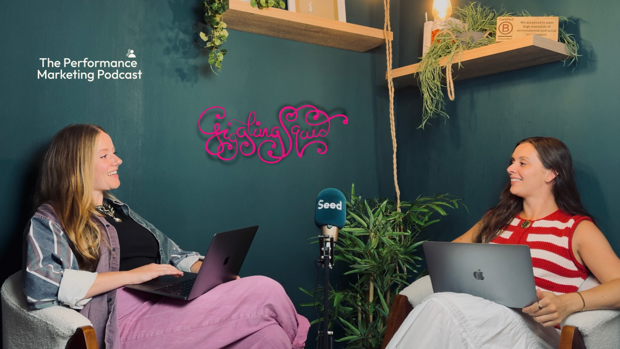
I sat down with Beth and Vic to learn how they drove 42% more bookings for Giggling Squid
by Gaby Rollinson
Let's build something that performs
Whether you're scaling up or shaking things up, we'd love to chat about how we can help. No hard sell — just a conversation about your goals.